We often hear that a site needs to be “user-friendly”. But what does this really mean? Is it just a question of design? Or ergonomics? Or something else?
A user-friendly site is much more than just a pretty site. It’s a site designed with the user in mind: simple, fluid, fast, reassuring. In this article, we help you to understand the real expectations behind this term, and how to check whether your own site is really user-friendly.
What exactly is a user-friendly site?
A “user-friendly” site is one that makes life easier for the visitor. For example, a user-friendly restaurant site will allow visitors to view menus, reserve a table and find the address in just a few clicks, without having to spend 10 minutes searching through complicated pages. It makes it easy for them to find what they’re looking for, to navigate without wondering, and to act quickly (buy, reserve, fill in a form…).
It’s not a matter of taste or trends. It’s a question of logic, empathy and prioritizing the user experience.
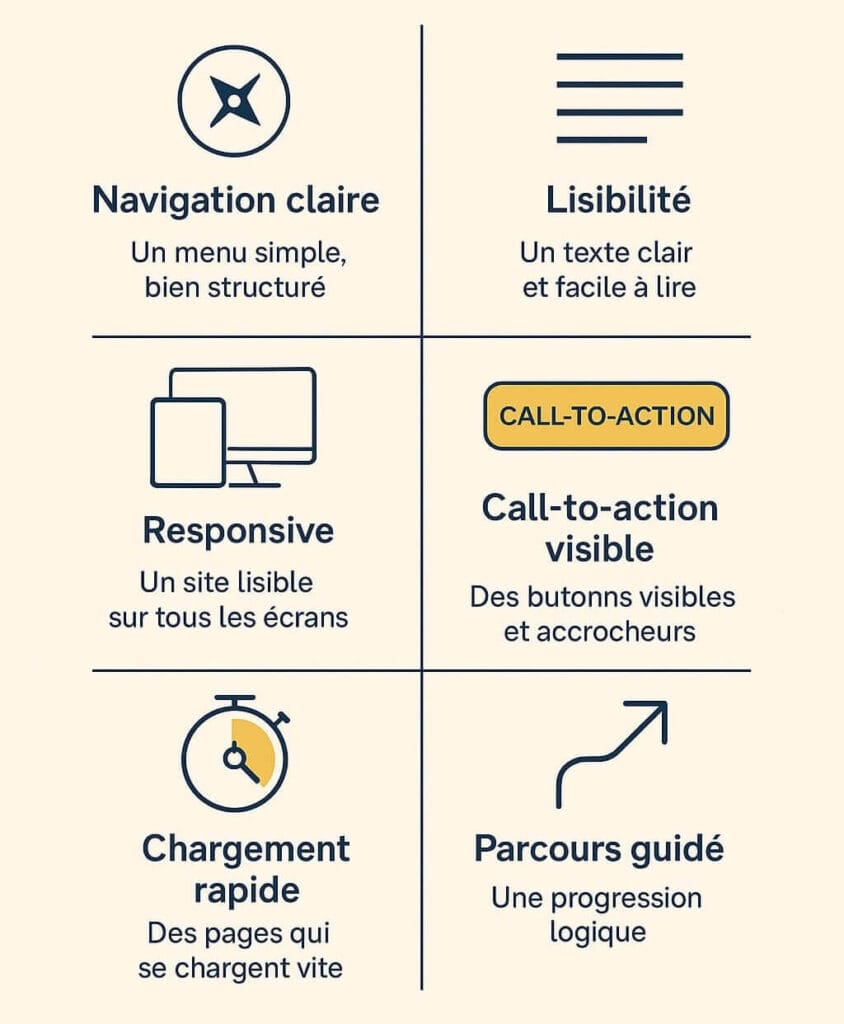
The 6 pillars of a truly user-friendly site
a) Clear, logical navigation
Users must be able to understand in a few seconds where they are, what they can do, and how to go back.
Simple menu, coherent structure, logical path between pages: no lengthy menus, no ambiguous names. We aim for clarity.
b) A display adapted to all screens
Your site must be 100% responsive, i.e. readable and fluid on smartphone, tablet and computer. Over 58% of web traffic comes from mobile devices (source: Statista, 2023). No broken displays, no mandatory zooming.
c) Fast loading speed
A site that takes more than 3 seconds to load can drive away up to half your visitors. Image optimization, script weight and hosting have a major influence on speed.
d) Easy, comfortable reading
Legible typography, appropriate text sizes, sufficient contrast, airy paragraphs: the reading experience counts. Clear, well-organized content also means respect for your visitor.
e) Visible calls to action
Each page should lead to an action: contact, reservation, quote request, add to cart. The button must be visible, understandable and well-positioned. You don’t need 10 of them: 1 per page is often enough.
f) A path designed for the user, not for you
You know your company, but the visitor doesn’t. A good site anticipates their questions and doubts, and leads them naturally to what they’re looking for. A good site anticipates their questions and doubts, and leads them naturally to what they’re looking for: a quote, a catalog, practical information.
The little extra: the emotional experience
A user-friendly site is more than just functional. It inspires confidence. It reassures.
How? By avoiding aggressive pop-ups, adopting a human tone, displaying social proof (customer reviews, partner logos…). And by creating a visually coherent atmosphere: colors, style, photos.
How do you know if your site is really user-friendly?
There are several simple and effective ways to check this:
a) Let an outsider test the site
Someone unfamiliar with the site may spot things you don’t see anymore. Let them browse freely and observe.
b) Analyze your statistics (Google Analytics, Matomo, etc.)
High bounce rate? Short time on page? These signals show that something is blocking or confusing your visitors.
c) Ask for direct feedback
Small surveys, footer questions, feedback forms… It’s simple, and often very instructive.
d) Use a tool like Hotjar or Microsoft Clarity
These tools allow you to record sessions or display heat maps to see where people click, scroll or abandon.
e) Have a mini UX audit carried out by a professional
One hour of consulting can be enough to identify the most critical bottlenecks.
Conclusion
A user-friendly site isn’t just a trend or a buzzword. It’s a site that respects the user, genuinely helps them, and transforms their visit into a fluid, positive experience.
At Pyxa, we design websites that get straight to the point: simple, effective and designed with your visitors in mind. Because a good site is one you understand without having to think about it.
Wondering how user-friendly your site really is? Let’s have a chat. We can do a quick review together, free of charge, to identify the most useful areas for improvement. Or find out more about our web agency in Valais and how we can help you.
FAQ – User-friendly site: frequently asked questions


Leave a Reply